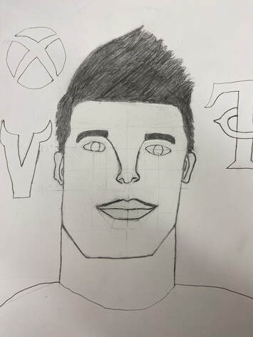
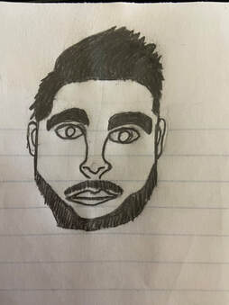
 My artwork looks like teenage guy around 16 to 17 years old, he has 3 logos floating around his head. The logos are the Vikings logo, The Twins logo, and the Xbox logo, the logos are there to show a few of the things that this guy likes. My artwork was created using a paper and pencil and lots of eraser. The big idea of this artwork was to make something that i wouldn't usually draw and make it look better than it would usually look like. The goals for this art was to make it look good and my overall thoughts are that it came out pretty well and that it looks better than almost everything else i've made so far.
0 Comments
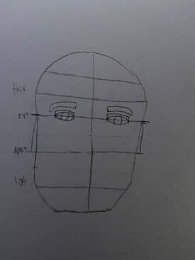
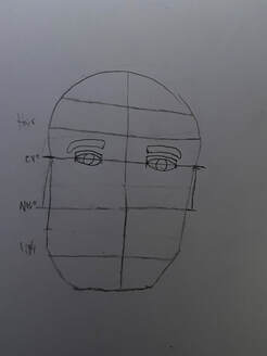
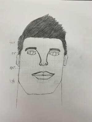
For my final art project i will be making a self portrait, before i start attempting to make my final rt a start by learning how to make a face by watching a video and doing exactly what the lady in the video does. After that i make a smaller face without watching a video and after that i decide that i will start making my final project.
 I created this artwork using pencils, notebook, and my chromebook. My thoughts on my artwork are that it turned out better than i thought it would and the logos that i put in there don't look to bad either.
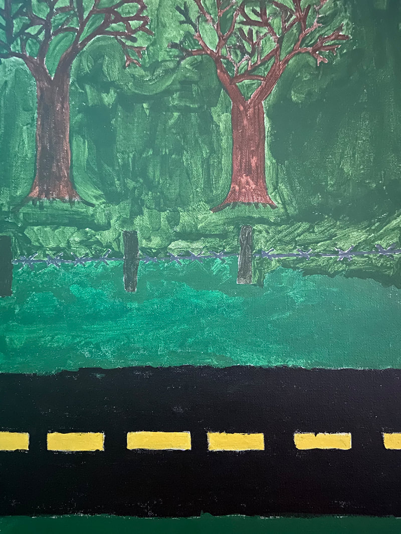 This is my finished landscape artwork, i think that this artwork could have turned out a little bit better but i ran out of the green i was using and decided to use some paint that i found in my house and as you can see the two greens arent exactly the same color and one was more watery than the other.
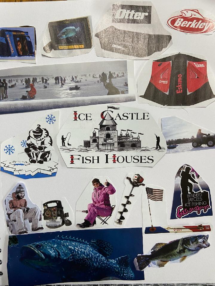 This is my collage artwork, i didn't know what i wanted to make at first so i just started digging threw some old magazines until i found an ice fishing one. My inspiration for this artwork was all the fishing that ive done so far with my friends and family.
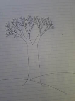
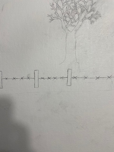 This is my landscape artwork so far, it may look boring and plain at the moment but i have plans to make it look better before i can actually consider it finished. I will add more trees and grass to it and then paint it then it will be pretty much finished.
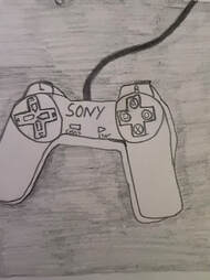
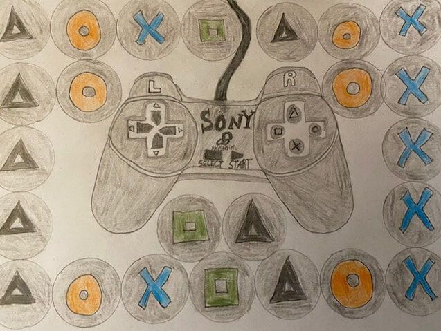 My artwork is a drawing of a playstation 1 remote, I created this artwork using colored pencils. The big idea with my artwork is to show how the old controllers looked and to show how the playstation company first controllers looked. My goal for this art work was to make the controller look as realistic as possible. My overall thoughts of this artwork is that the controller turned out pretty good but the background could have been a little more detailed.
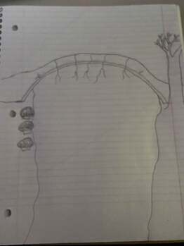
Dan Bruggermans art shows how man made structures make nature look more beautiful or ugly. My art shows how the old man mad bridge doesn't exactly make the scenery look worse but instead makes it look more beautiful in a way. I would say that the bridge has enhanced how the scenery looks.
|

 RSS Feed
Photo used under Creative Commons from Tony Webster
